AutoRentals • Rebrand, Design System, & Web App Overhaul
Reimagining car rental booking, by first prioritizing brand and user experience enhancements
B2C Travel
Industry
3 Months
From vision to launch
+18%
Conversion increase
Sales Boost
Supplier/Partner relations
Overview
AutoRentals' vision is to revolutionize the online car rental industry through renter first product solutions.
My role
UX Researcher, Visual Designer, & UX/UI Designer
The team
Head of Product, Lead Frontend Developer, Full Stack Developer, Jr. Frontend Developer, & UX/UI Designer (myself)
I synchronized the design kanban board with the engineering 2-week agile sprint development cycle.
Problem
The product lacked a cohesive experience and common design language.
Pain points
Not attracting new partnership interest or building upon current partnership confidence.
Low customer trust in the brand, resulting in lower conversion and loyalty rates and no new organic traffic to the site.
Product goals
Revitalizing the brand and user experience was my first priority on the roadmap to lay a solid foundation for future feature enhancements and integrations.
Establish product trust and build stronger relationships with users, suppliers, and partners by modernizing the brand.
Create a foundational design system and establish a cohesive design language across the organization.
Overhaul the site to improve usability, increase user engagement, and encourage user interaction through a cohesive experience.
Homepage before/after rebrand and design system
Business impact
The team met the first-quarter deadline, finishing within three months, enabling progress on the next set of roadmap initiatives.
Conversion rates increased by 18% over time in the following quarter.
Received positive feedback from suppliers and partners, stimulating sales growth.
Key learnings
Research and data strengthen your solutions by uncovering overlooked insights, reinforcing your claims.
Implementing a design system can boost conversions and streamline design and development processes through a shared design language.
Iterative processes can optimize the customer journey while minimizing revenue risk.
Search results page before/after rebrand and design system
Step 1
Research
Step 2
Concepts & Buy-in
Step 3
Design System
Step 4
Build & Ship
Checkout page before/after rebrand and design system
Step 1: Research
Gaining insights into the product, competition, and users to develop a research-driven solution.
Strategic problem solving through research
What I did:
I assessed the current product experience, researched competitors and the industry, and conducted user and stakeholder interviews to develop concepts and establish a new strategic brand style and design system.
How I did it:
Step 1: To start off, my first priority was to complete a system review of the current product experience.
Step 2: Then I carried out extensive research through planning, conducting competitive analysis, and interviewing.
Step 3: Lastly, by using data-backed insights, I identified problems to be addressed, rather than relying on guesswork, and generated informed concepts.
Challenge:
The initial obstacle I faced involved a dearth of industry context, which included unfamiliar jargon, emerging trends, the desires and requirements of users, as well as the customer journey throughout the travel shopping experience.
Solution/learnings:
Through diligent research and extensive discussions with experts, I gained deep industry knowledge and leveraged past experience to uncover valuable insights that even stakeholders had not considered.
Evaluating the current experience
I conducted a system review through a cognitive walkthrough and heuristic evaluation, by navigating the booking funnel – searching for a car rental, comparing options, and completing the checkout process.
Additionally, I familiarized myself with all the essential pages and components of the website and analyzed microinteractions, documenting user and task flows.
Below are some previous screen samples
Below is the previous logo
Research plan and user interview script
To gather qualitative data, I developed a research plan outlining objectives and methods aligned with the overall product goals. This laid the foundation for my research efforts.
Also, during the research planning stage, I prepared an interview script to serve as a valuable tool in conducting user interviews that were in line with the provisional user personas.
Competitive and industry analysis
After conducting a comprehensive competitive and industry analysis, I created a summary of significant findings that could be transformed into valuable insights for identifying opportunities during the rebranding and style guide creation process.
Key opportunities:
Revamp the brand identity to achieve a premium, contemporary look akin to direct competitor Kayak and indirect competitor Airbnb, thereby improving online visibility and fostering customer loyalty among travel shoppers.
Create a style guide that draws inspiration from established, reputable brands like Amazon, ensuring consistency and familiarity for users beyond the travel industry.
Identifying user insights
I created an empathy map after conducting user interviews to identify the pain points, goals, emotions, needs, and frustrations of travel shoppers.
Key pains most relevant to project:
Getting scammed. Struggling with brand trust.
Information overload and cluttered site pages.
Key gains most relevant to project:
Booking on a reliable trusted site with minimal issues.
Easy to understand, navigate, and seamless booking process.
Summary of findings: problems and opportunities
I used my research findings to generate data-backed hypotheses, informed by my competitive analysis, user interviews, and subject matter expert consultations.
Most relevant problems:
Site appears untrustworthy due to outdated and inconsistent design.
Poor brand identity and user interfaces affecting partnerships.
The market is dominated by Expedia and Booking Holdings.
Most relevant opportunities:
Establish inviting experience with consistent and modern design.
Prioritize renters for user satisfaction, increased revenue, and partnerships.
Analyze and implement successful shopping patterns for travelers.
Step 2: Concepts & Buy-in
Effectively integrating all research to ideate strategic concepts and achieve stakeholder buy-in.
Putting it all together in alignment with leadership
What I did:
Having completed extensive research and analysis of the gathered data and insights, I formulated well-researched concepts for a rebrand and design system creation. Then, I presented those concepts to the leadership team for review and approval.
How I did it:
Step 1: Based on the problems uncovered through my research, first I gathered inspiration, developed a preliminary style guide, and generated logo and icon concepts.
Step 2: Then, I reviewed my concepts with the Head of Product and refined them based on his feedback, focusing on key concepts.
Step 3: Next, I prepared and led a comprehensive review meeting with stakeholders, presenting my design process and conclusions, and concluding with a Q&A session to gather feedback.
Step 4: After promptly integrating stakeholder feedback, I finalized the concepts and presented them in a final meeting to obtain approval and buy-in on the final direction.
Challenge:
Getting buy-in on a new brand and design system implementation was challenging as the leadership team initially did not understand the importance.
Solution/learnings:
By demonstrating the advantages of a design system through data-backed decision-making, positively steering the conversation, and overcoming initial pushback during the first review meeting, I improved my communication skills and built trust among leadership.
Mood board
I initiated the design process by gathering inspiration from competitors, the industry, and my research findings. To organize my ideas, I created a mood board on Pinterest to serve as a starting point for developing the rebrand and style guide concepts.
Style guide and identity concepts
Style guide concept (V1)
Before the identity ideation phase, I created a preliminary style guide utilizing the previous logo, which served as a reference point.
Logo concepts
After gathering inspiration and creating a style guide, I developed multiple logo and icon concepts. These concepts were presented to the Head of Product, and based on his feedback, I refined and selected the optimal design direction.
Logo proposals
After incorporating his feedback and iterating upon the designs, I finalized three concepts that accurately represented ideas I found from my research.
Leadership buy-in meeting
In order to acquire feedback and gain approval, I composed a comprehensive presentation and led a meeting with leadership, where I shared my research, concepts, and emphasized how my design concepts could elevate the overall user experience.
Attendees included: CEO, CFO, COO, VP of Marketing, Head of Technology, Head of Product, & myself
Final logo & icon options
I presented an additional four logo options, nine icon options, and a refined style guide, that incorporated feedback from the leadership team.
Style guide concept (V2)
Expanded style guide into design system concept
Step 3: Design System
Finalizing the rebrand and design system
The ideation process established a cohesive and consistent visual identity for AutoRentals, resulting in a modernized logo, icon, color scheme, typography, and the creation of AutoRentals' inaugural holistic design system.
After obtaining approvals, I finalized the rebrand and design system, applied new styles to all brand platforms, and created asset pages in Confluence and Google drive for company-wide access.
Design System foundations
Final logo and icon
Following feedback and discussions, the leadership team unanimously agreed on this final logo and icon to proceed with.
Color palette
I established an accessible color palette for the design system by synthesizing feedback, research, and material design principles, while also incorporating AutoRentals' new signature red as the foundational element.
Primary colors
Neutral colors
Semantic colors
Typography
I chose to use the combination of Open Sans and Montserrat font families in the design system because Open Sans offers clean and modern legibility, while Montserrat adds elegance and sophistication. Together, they strike a harmonious balance that enhances readability and visual impact, ensuring a cohesive and engaging design.
Fonts
Headings
Body
Button
Iconography
I created a versatile set of icons with accompanying tags for effortless implementation, streamlining development and ensuring a cohesive user interface.
Defining breakpoints and the grid
I led a meeting with the Frontend Engineering team to establish standardized breakpoints, implement a grid system, and address best practices for the web app, which lacked these features and suffered from conflicting opinions on specifications.
Attendees included: Lead Frontend Developer, Full Stack Developer, Jr. Frontend Developer, & myself
Grid system
After collaborative discussions and note-taking, we reached a consensus and aligned on the topic. I integrated feedback to create a final grid system, which would ensure consistency across all web app pages.
Radius
I created a 4-pixel increment-based radius range to align with the development's system, enabling seamless coordination and easy scalability and adaptability.
Spacing
To achieve a harmonious and well-structured layout with visually balanced gaps between UI elements, I established a spacing range utilizing 8-pixel increments for consistent and precise spacing.
Design System Components
Buttons
I created a button component set using brand primary colors to establish consistent styles, ensuring a cohesive visual language and fostering familiarity for users. This reduces cognitive load and enables intuitive navigation and interaction with the interface.
Button component set
Button anatomy
Button types
Button styles
Button states
Button sizes
Button properties
Selection controls
I developed a collection of selection control components, including radio buttons, checkboxes, and toggles, by leveraging familiar and standardized interaction methods to offer a seamless and intuitive way for users to select options effectively.
Selection control component set
Selection control anatomy
Selection control types
Selection control states
Selection control properties
Inputs
I designed a comprehensive set of inputs, encompassing form fields and interactive elements, to deliver a cohesive and delightful user interface for seamless interaction with the web app.
Input component set
Input anatomy
Input types
Input states
Input properties
Alerts
I created a set of attention-grabbing alert messages with consistent styling, clear messaging, and appropriate urgency levels to promptly inform and empower users in responding to critical updates, warnings, or errors.
Alert component set
Alert states
Alert properties
Alert anatomy
Step 4: Build & Ship
Implementing the new style guide by developing a roadmap, building hi-fi designs, and collaborating with engineering throughout the process, from inception to launch.
Site overhaul, project management, and launch
What I did:
After finishing the second phase of the project, I created a roadmap for efficient project management, utilized rapid prototyping to implement the new design system, and worked closely with the engineering team to ensure the successful deployment of the web app overhaul in four phases.
How I did it:
Step 1: My first focus was to create a project roadmap that prioritized web app components and pages into four phases based on importance, detailing the most relevant info needed.
Step 2: My second objective was to rapidly build all web app pages from scratch using Figma within two weeks to meet the project timeline.
Step 3: After organizing all pages into four Figma files based on the project roadmap, I conducted engineering planning meetings to review the files and created a dedicated Slack channel for seamless communication and collaboration.
Step 4: I collaborated with the Head of Product to create tickets and sprint plans for the project and participated in sprint engineering planning meetings. Then, the engineers started their work on development.
Step 5: After completing each phase of the overhaul, I conducted comprehensive quality assurance on the pages, signed off on each release phase, and engineering merged them to production.
Challenge:
During the site overhaul, we A/B tested various search result page variations to test new concepts before completing the entire overhaul. However, we encountered data issues in the testing platform, which halted new page creation. To revamp the site quickly without impacting revenue, I created an alternate solution.
Solution/learnings:
To continue progressing against the product roadmap, I opted to revamp the site with minor UI changes and implementing the design system, preserving most user flows and the customer journey; which still increased conversions, enabling later testing of new experiences.
Project roadmap
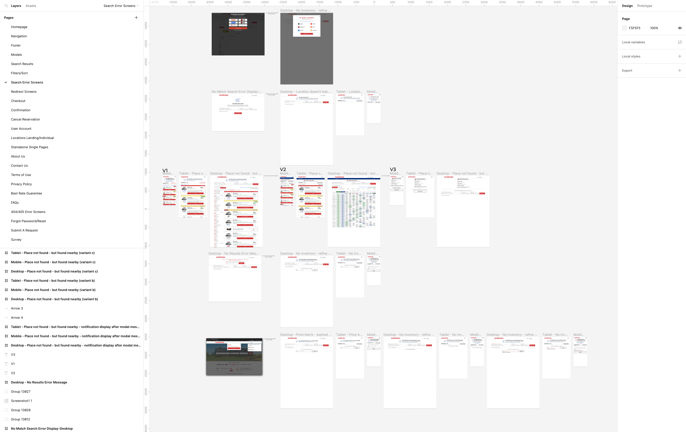
I created a roadmap for the web app overhaul, dividing all pages and components into four phases (A-D) based on priority for going live to maintain site coherence. I included key information for each page such as name, URL, notes, assigned personnel, progress status, and development stage.
Below are screenshots of the shared Google sheets tracking file
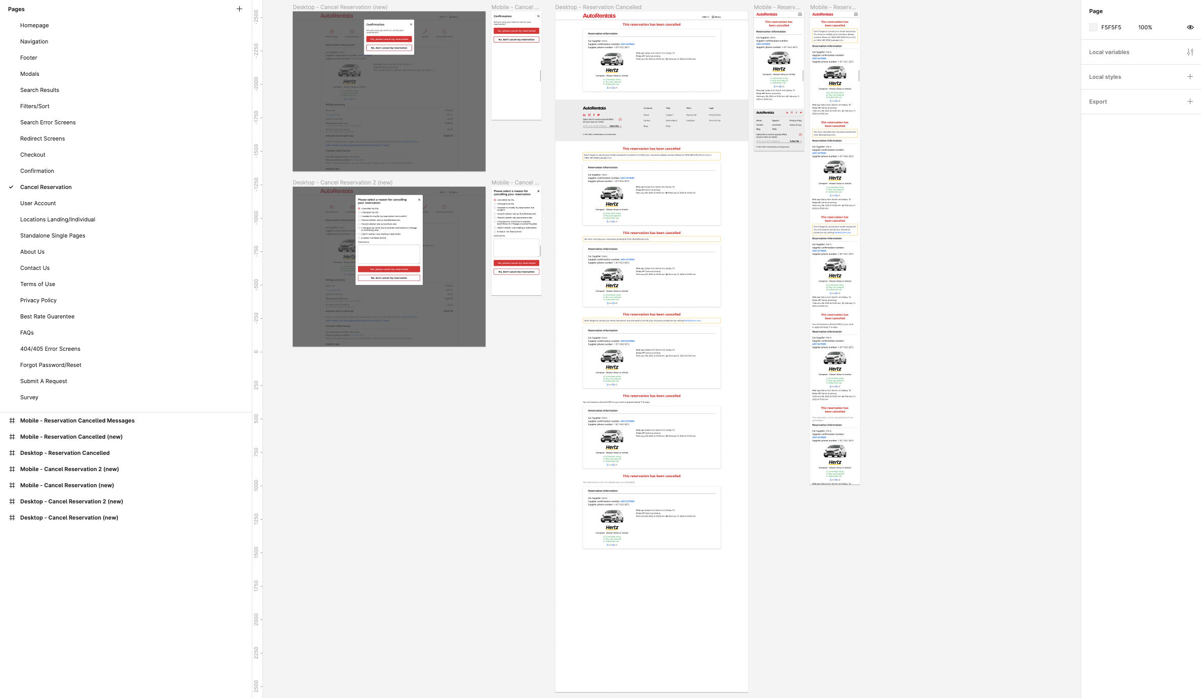
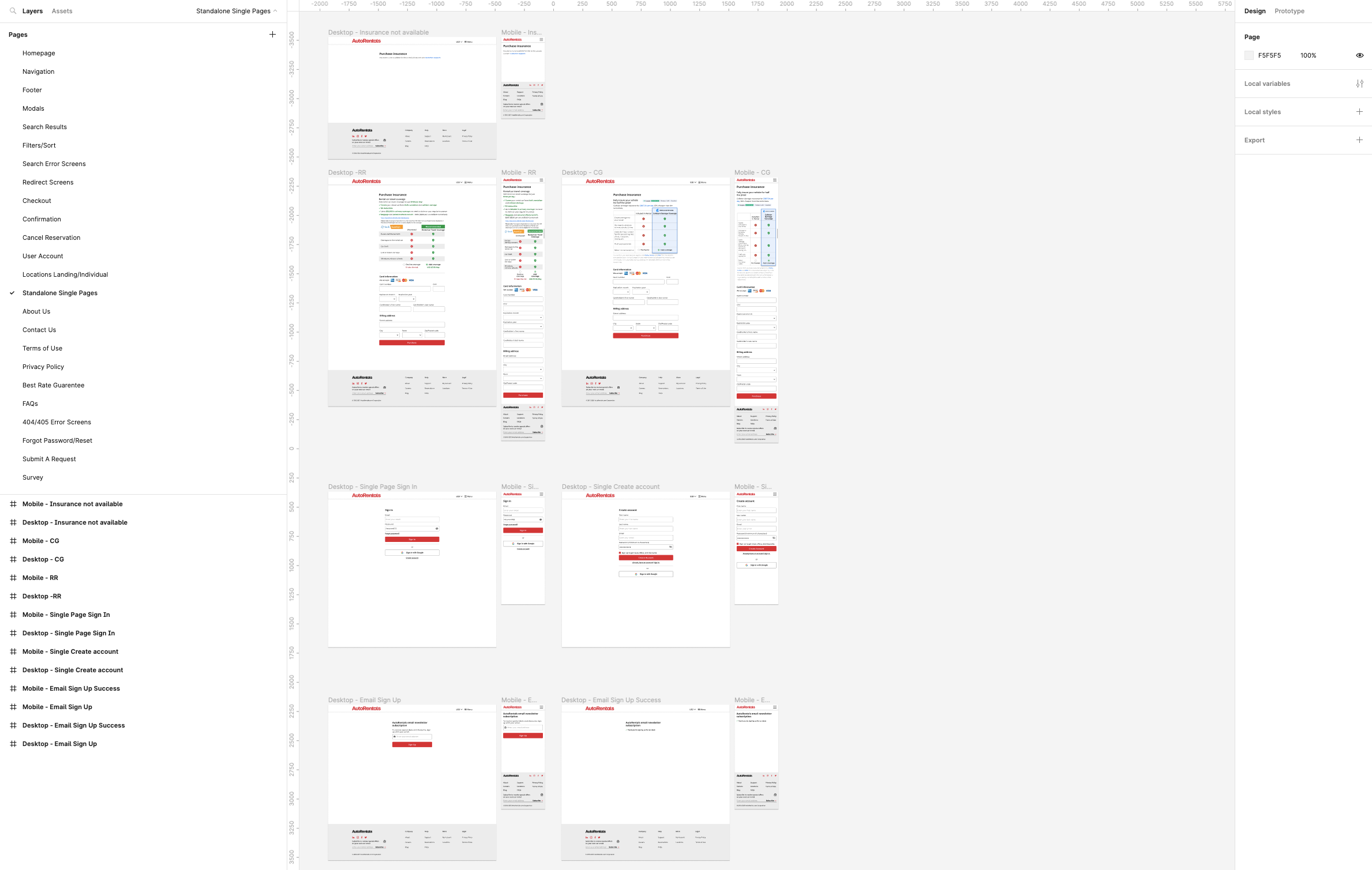
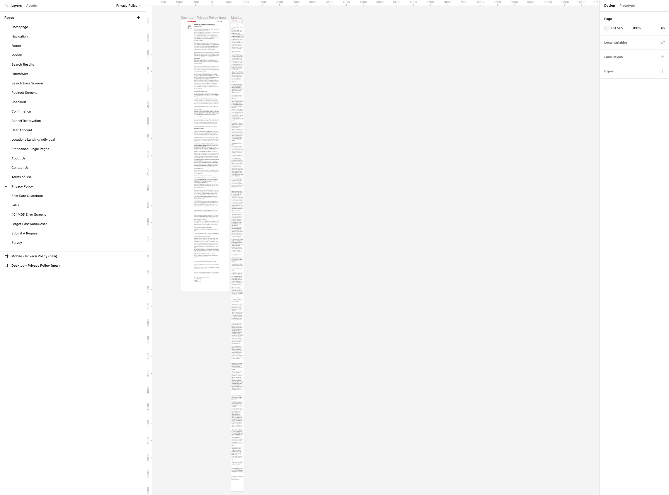
Figma-organized hi-fi designs
Within two weeks, I rapidly created high-fidelity designs in Figma for all web app pages to give ample time for development, quality assurance, and production migration over the quarter.
Below are screenshots from the Figma files
Handoff and project planning
Planning, QA, and production migration
After finalizing all files, I organized and led engineering planning meetings to review the roadmap, designs, and address questions.
Attendees included: Lead Frontend Developer, Full Stack Developer, Jr. Frontend Developer, & myself
The final step was to create tickets and sprint plans, start development, QA each phase of the project, sign off on release, and migrate to production.
Post-overhaul
After the web app overhaul, our main focus was on optimizing user engagement, revenue growth, and overall user experience. We implemented a comprehensive process consisting of creating features, conducting user testing, performing A/B testing, and analyzing the collected data.
We generated potential features, prioritized them based on impact and feasibility, and seamlessly integrated them into the web app. A/B testing involved dividing users into control groups, quantitatively measuring the impact on key performance indicators. Through rigorous data analysis and consideration of qualitative feedback, we iteratively refined the features to enhance performance, drive revenue growth, and improve the user experience.


